SPATIAL INDIA FOR DATA JOURNALISM
The fastest way to map India's data stories
75+ district-level indicators — demographics, health, gender, economy, climate — pre-loaded and ready to visualize. Find the pattern, explore the outliers, and export a publication-ready map. No shapefiles. No QGIS. No data wrangling.
WHY INDIA DATA STORIES TAKE TOO LONG
No India-specific data vis tool exists
Generic chart tools are excellent — but they don't come pre-loaded with Indian district boundaries and Census data. You start from zero every time: find the data, clean it, upload it, map it to districts. That's an afternoon before the first visual.
The story is in the correlation, not the single variable
"Districts with high female literacy but poor maternal health outcomes" — that's the story. But finding it means loading two datasets, joining them to boundaries, and scatter-plotting them. Without a tool that does this in clicks, the story stays unfound.
QGIS maps are powerful but slow to produce
A QGIS choropleth needs: shapefile download, CSV download, attribute join, colour styling, legend creation, export settings. For a single map. If your deadline is tomorrow, that's not a viable workflow.
FROM DATA TO STORY IN MINUTES
PNG Map Export
Export publication-ready choropleth maps with legend, colour scale, and full data source attribution. No screenshot cropping, no design team needed. One click to a visual that meets editorial standards.
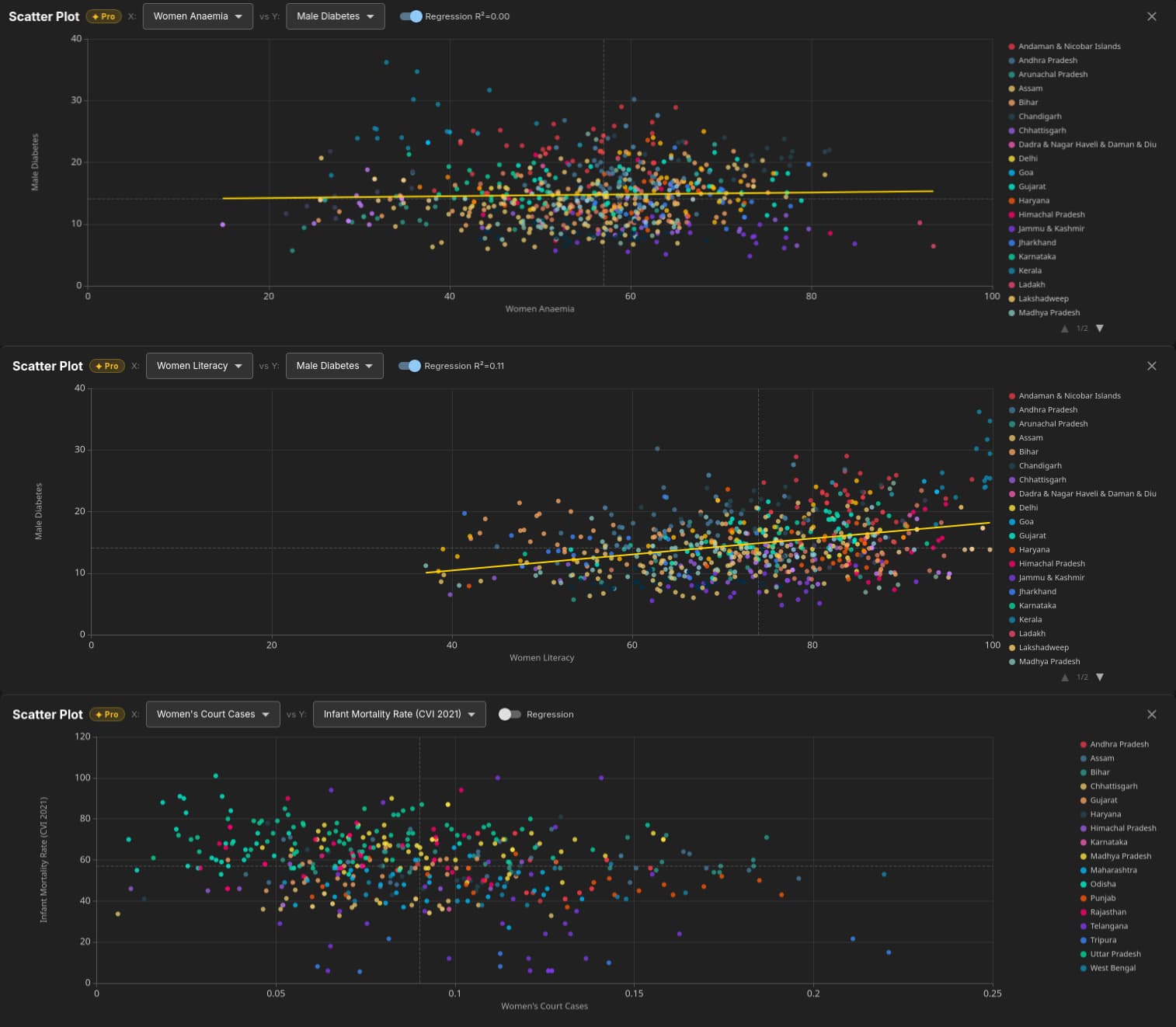
Scatter Plot (Find the Story)
Plot any two indicators against each other across 800+ districts. Points coloured by state. Regression line with R². Hover any dot to see the district name. The outliers — the dots far from the line — are your story leads.
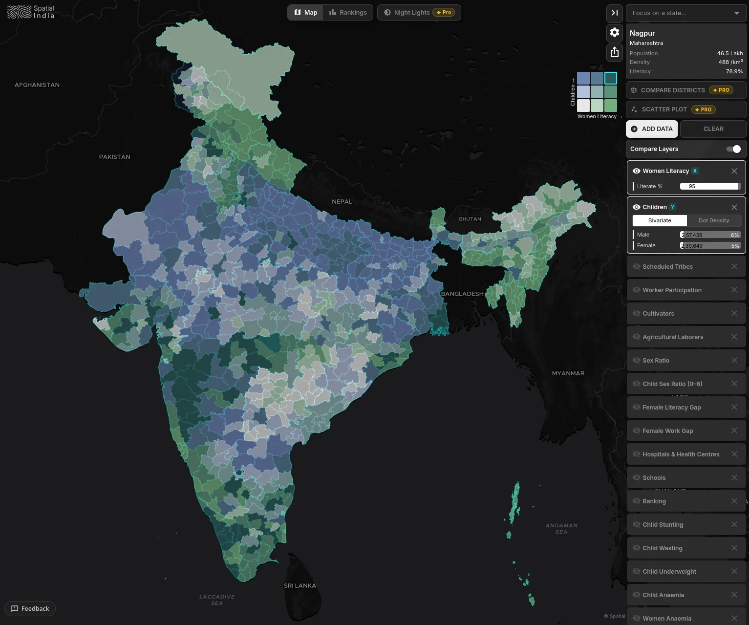
Bivariate Choropleth (Show Complexity)
Map two variables simultaneously with a 3×3 colour matrix. "High stunting AND low vaccination" shows up as a distinct colour. Perfect for stories about intersecting deprivations — where two problems compound each other.
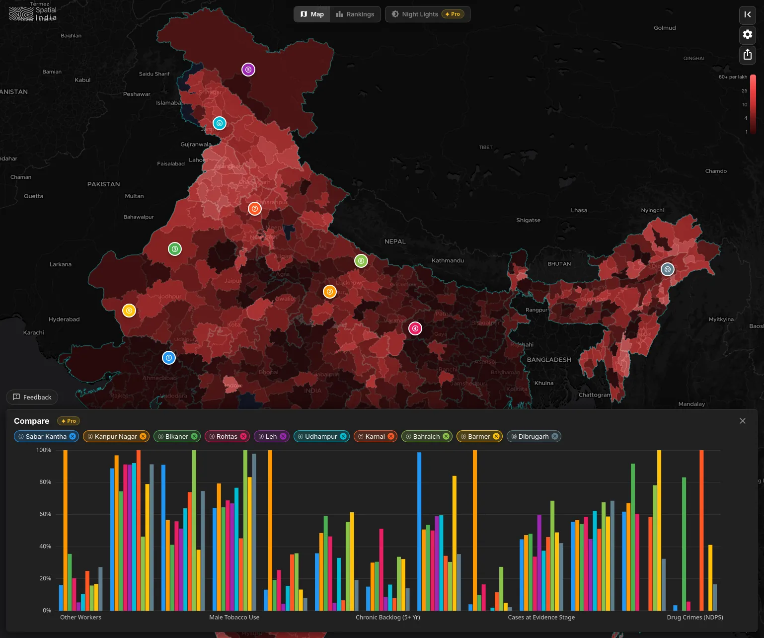
Compare Districts
Pin districts from your story and compare them side-by-side across every active indicator. Normalised bar charts make the contrast visual — "District A spends more but scores worse." The comparison is the lede; the chart is the graphic.
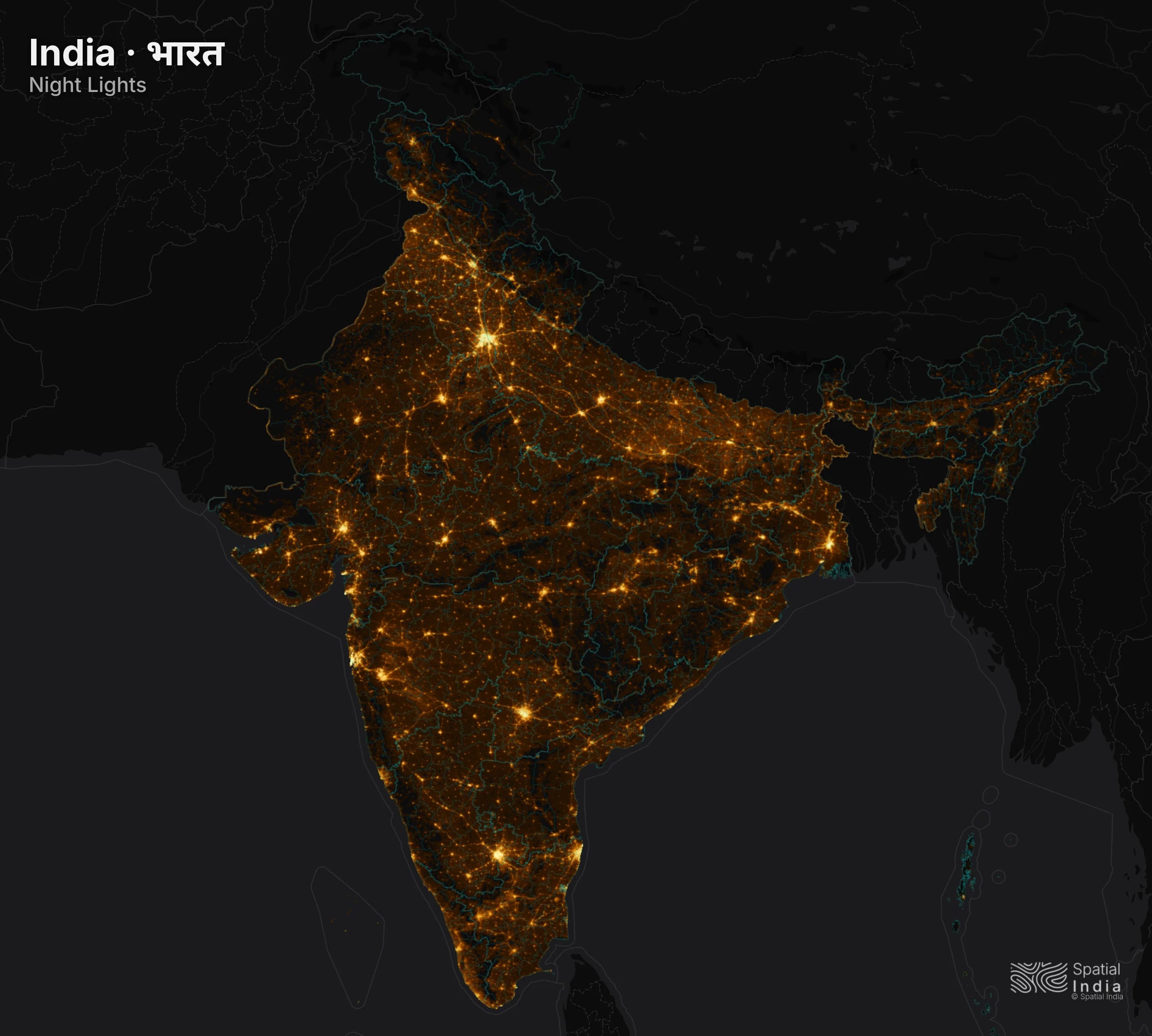
Night-time Lights
Overlay satellite imagery showing where India lights up at night — and where it doesn't. Ten years of annual data. The visual is instantly compelling, and the correlation with demographic data is a story machine.
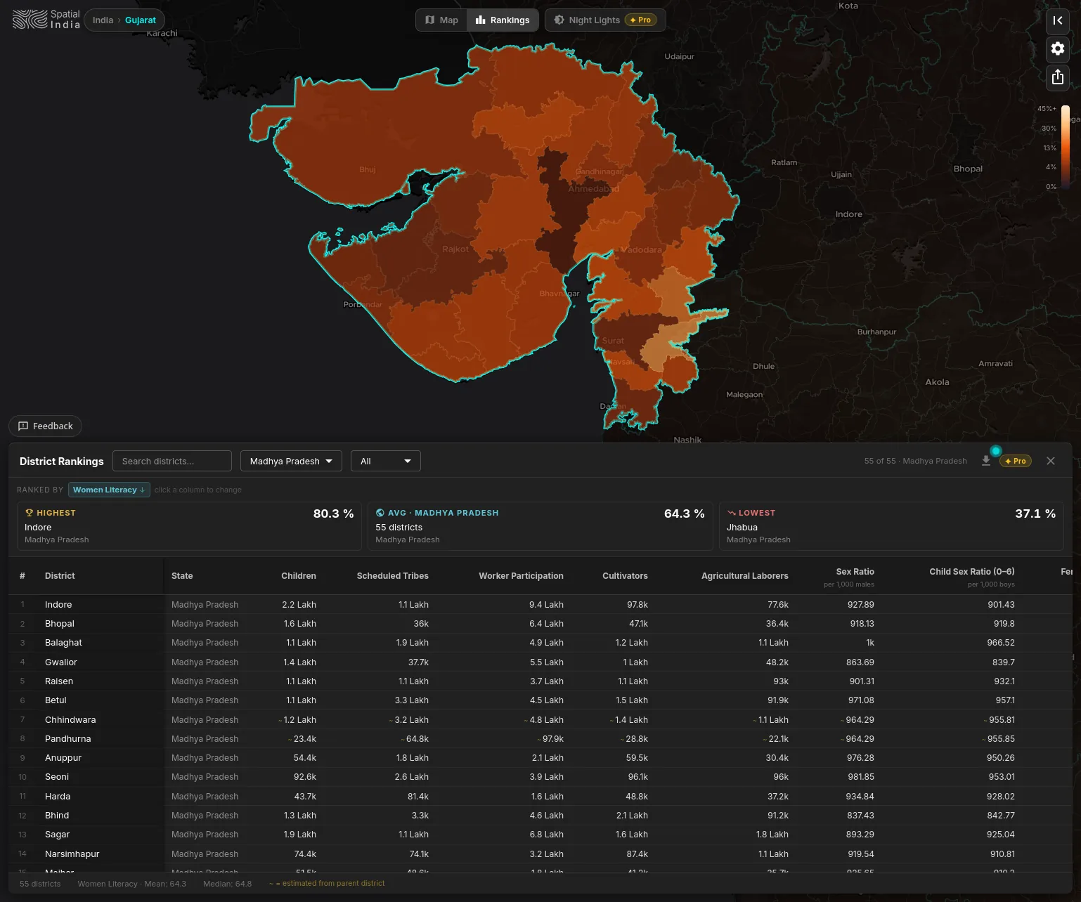
District Rankings
Rank all 800+ districts by any indicator. "India's 10 most literate districts." "The 50 worst on child stunting." "Districts with the lowest sex ratio." Sort, filter by state, spot outliers. The top/bottom list is the oldest story format — now with 75+ variables to rank by.
PRE-LOADED. PRE-MAPPED. READY TO EXPLORE.
STORIES WAITING TO BE TOLD
India`s gender gap, mapped
Layer child sex ratio, female literacy gap, or teen pregnancy across all districts. See which states and districts are outliers — in both directions. Export the map and file the story.
Where India`s economy actually is
Overlay night-time lights on population density. Find the districts that are bright but sparsely populated (industrial corridors) and the ones that are dark but densely populated (underserved markets). The contrast is the story.
Election coverage with demographic depth
Focus on a state. See how its districts compare on literacy, healthcare, and economic indicators. Add demographic context to election coverage beyond vote shares and polling data.
INDIA DATA STORYTELLING, COMPARED
| Feature | Generic Chart/Viz Tools | Desktop GIS Tools | |
|---|---|---|---|
| India district data, pre-loaded | 75+ indicators, ready to explore | ||
| Interactive choropleth mapping | Any indicator, one click | (upload your own data) | (hours of setup per map) |
| Story discovery via correlation | Scatter plot with R², outlier hover | (chart only, no map link) | (plugin, scripting) |
| Two-variable mapping (bivariate) | 3×3 matrix, intersecting patterns | (plugin required) | |
| Night-time lights economic layer | NASA VIIRS 2015–2024, annual | (manual raster pipeline) | |
| Works in your browser, zero setup | No upload, no data wrangling | (data upload required) | |
| Publication-ready map exports | PNG with legend & source attribution | (generic styling) | (manual cartography) |
| District ranking & outlier spotting | Rank 800+ districts, find the story | ||
| Census 2027 ready | Architecture ready, day-one support |
Spatial India vs Generic Chart/Viz Tools
Spatial India vs Desktop GIS Tools
The map is loaded. The data is ready. Find your story.
Free access, no login. Every export includes full source attribution. Built for Indian data stories that need to ship today.
Data story leads — new indicators, surprising patterns, ready-made maps.